
I have learnt that it is important to consider how images, font, colour and theme represent the artist's star image and how that image should be continued throughout these products to appeal to their target audience.
For my own digipak and poster I have taken inspiration from existing products within the indie/folk genre and used their conventions to create ideas. This has helped me think about what elements would be successful in order to promote my artist.
Initial Ideas:
I want to stick closely to the theme of 'Peter Pan' for the products as it will successfully tie together the music video and the promotional items. This will be effective as the consumer will be able to identify a strong sense of the artist's star image. I will also incorporate relevant images that visually illustrates the themes in the songs. These images will include appropriate scenery including skies, fields, woodland areas etc as I believe this will give the best representation of the genre. On top on this, I will also think about including Oliver's existing theme of triangles. I believe that this concept should be highly considered as existing fans will identify the image and relate it back to Oliver's work.
Here I have tried to take images for the image to be used on the front of my poster and digipak. I have used images of Peter Pan, printed and cut them out and held up to the sky to get an image of the sun and clouds behind it. This will represent the theme of being 'high' and tie in with the image of Peter Pan that I wanted to incorporate.


However, after only using a paper cut out, my design did not work out how I imagined and I have to take an alternative approach. Instead, I will be experimenting on Photoshop to create a product I will feel confident with.
Final Stages: Photoshop
 Stage 1: Selecting template I wanted to use for my Digipak. The template is four panel which includes the front, inside, CD holder and back. This is a standard look for a digipak, but is usually the most common. I will have to design a piece of artwork for each panel.
Stage 2: I have inserted the images I want to use. These are all pictures that I have taken whilst filming my music video to make sure that the style of the digipak links in with the video. The images are typical of the indie/folk genre as it shows off the natural elements.
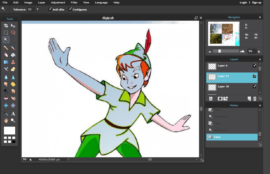
Stage 3: Here I have added a layer on top of the images. This has tested my skills on Photoshop as I have had to erase half of the picture so the image can be seen underneath. Adding layers such as Peter Pan will stick in with the theme of my video and create an establishing look.


I have now created products that I feel confident to promote Oliver's work. The use of Photoshop has enhanced the quality of production as I was given the opportunity to use all of its features to experiment how I wanted my final products to look. Looking at my products, there are clear references to the indie/folk genre as I have incorporated images of nature and kept to a very natural colour scheme. I have also tried to include the narrative of Peter Pan from my music video as I believe this will make all three products memorable to followers of my artist. As for other existing products in this genre, my digipak design appears original in result of my ambition to stick to a theme. This will be effective as it signals out my artist's look which is key when competing with other unsigned artists in this genre.
No comments:
Post a Comment