Thursday 28 April 2016
Evaluation: Question 3
What have you learnt from your audience feedback?
To understand how my audience felt about my media products, I invited a group of audience members to view my work and then to created an online questionnaire which would give them the opportunity to express their personal opinions on how the video and promotional texts work. This is an important element to consider as my job as a director is to produce products which promotes the artist successfully.


In my questionnaire, I included questions which would help me identify whether my final products served their purpose. As narrative was one of the most important aspects for my video, I wanted to know whether they understood the approach that I took. From my results, I can see that the story of Peter Pan and Wendy was successfully told. This is good feedback to receive as I feel like I have accomplished my initial goal. I then continued to ask whether the narrative illustrated the lyrics or not. Again, all my feedback suggested that I had successfully amplified the lyrics and made a visual connection with them. After my conversation with the artist, I believed that this was an important concept to try and incorporate as the lyrics have a significant meaning to him. Now that I know that this purpose has been filled, I can feel confident that I have represented my artist and his music well to the potential audience. Another major theme I had to establish was the genre of the music video. If the audience did not identify this video as Indie/Folk, then that concluded that my research and planning was not as successful as I anticipated. However, from the results, I can see that the participants agreed that my video belonged in this genre and the reasons they gave supports my research I have completed over the course on Indie/folk codes and conventions. In addition to this, I was curious to see whether my final edit worked well with my promotional items. Since my artist belongs to an Indie/Folk genre, I had to make products which would establish him in a genre what is not considered mainstream music, yet attract different audience members to his album. From my results, I can gather that all my products work well together as I have kept similar themes and images to ensure that Oliver's star image is predominate throughout.


In conclusion, the feedback from my audience has made me feel confident about my products. Not only have they enjoyed the video, but they believe that all the products work well together in order to promote my artist. This was my intention and I believe that I have completed my task to the best of my ability and have ensured that my artist's star image has been established enough to gain a new audience. I have also been insured that my products stay true to the indie/folk genre which means my research and planning have been effective even after post-production. After this feedback, I believe that the audience are left satisfied and my work has completed its purpose.
Tuesday 26 April 2016
Monday 25 April 2016
Evaluation: Question 1
In what ways does
your media product use, develop or challenge forms and conventions of real
media products?
Music video:
Settings: Whilst planning and filming my final
product, I decided to follow the stereotypical settings for an Indie/Folk video,
as I believed it was an important concept to consider. In Ellie Goulding’s ‘On
My Mind’ music video, Vegas played a key role in successfully setting the scene
for the video and inspired me repeat the same process. This included me to seek
out and locate different settings that would be appropriate for my chosen genre
such as fields, rivers, old ruins and parks. Not only was I able to film my
production on a low budget due to the accessibility of these locations, but
also gave me the opportunity to visit these sites on demand without requiring
permission. This then enabled me to practice and re-shoot different shots of my
music video until I was confident that I had all the footage required for
editing. In addition to this, the locations I selected also have great
significance in explaining the meaning of the lyrics. For example, the artist
makes clear reference to ‘fields’ and ‘skies’ on the track that I have then
visually amplified with including footage of these locations. This will illustrate
the main meaning that my artist is trying to portray to the audience without
rejecting the typical style of an Indie/Folk music video.


Narrative: For this genre, I believe it was vital to
for my music video to follow a strong narrative, especially since my artist was
unable to physically appear in it. After completing analysis on other music
videos in this genre, I was inspired by the narrative used in Ed Sheeran’s
‘Give me Love’ as Ed is only briefly featured in the video, yet manages to
express his star image to his audience. It also inspired me as it took a twist
on an old Greek myth (Cupid’s love bow-and-arrow) and incorporated modern
themes relevant in today’s society that made the video enjoyable to watch. After
much thought and research into existing products and old folk tales, I finally
agreed to base my music video around the story of Peter Pan. Although the video
does not tell an accurate account of the story, the character of Peter Pan does
help the audience understand the lyrics of the track from a different
perspective. Using a strong narrative throughout means that my video follows
the stereotypical conventions of an Indie/Folk music video, however the actual
narrative itself helps my video differ from others already out there to watch.
Costume: The costume I have used in my music video
follows the stereotypical conventions for this genre. After completing research
on popular clothing choices by arranging images onto a mood board, I had a
clear visual understanding on how I would have dressed my artist. However, as
my artist was unable to make an appearance in my final product, I had to create
an alternative idea which would connect him to the song, audience and video as
well as trying to promote his star image. The Peter Pan narrative allowed me to
create a look for my protagonist which fit well in with my chosen genre and
could be easily produced on a low budget. I was inspired by the costume choice
in the music video for ‘Give me Love’ as the actress playing Cupid was given an
outfit which represented her to be an angel, but in today’s society. After much
research on the history of Peter Pan’s appearance, I learned that his character
had a very established look of green clothing and tights. I wanted to include
some of these main item of clothing in my own production, but like the ‘Give me
Love’ video, add my own current twist. The outfit my protagonist is seen
wearing is a different approach on Peter’s usual costume, however it still fits
in with the stereotypical conventions of this genre as the costume was made on
a low budget which added a DIY element to the video. The current look also
develops this genre as it suggests that Indie/Folk music can break into
mainstream music today.


 |
| Guns and Horses |
 |
| Higher |

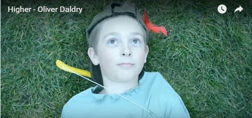
Performance: Performance is the main convention that
I decided to challenge in my product. Since many artists incorporate their
ability to play music in their star image, it is usually a very common element
to include. Music videos by Indie/Folk artists Lewis Watson and Mumford and
Sons prove by appearing to perform with their instruments in their videos.
However, since my artist could not appear in the music video, I decided to challenge
this convention by focusing on a narrative perspective instead. The narrative
of Peter Pan still has relations to the song as it suggests a place the artist
admired when he was young. It also is a metaphor of the title ‘Higher’ since
Peter Pan has the ability to fly. Due to these reasons, I believe that my
narrative approach is more effective than a performance based video as it has
many connections with the song and will keep the audience entertained
throughout.
Wednesday 30 March 2016

Saturday 26 March 2016
Advert Poster Analysis
From this analysis, I have a greater understanding on the different types of advert posters available for artists to use. The traditional posters refer to adverts featured in magazines and in the streets whereas mainstream adverts tend to focus promoting bands through online services. Each types has positive impacts for artists, depending on their budget and audience members. I also have a greater understanding on how women are represented through the use of posters. It is still very common for some famous female artists to expose their bodies in order to sell their albums. This could be blamed on the 'Male Gaze' theory, although it can be argued that women now have more confidence to show off their body in a more understanding society.
For my own poster, I believe my artist will benefit by using mainstream posters. This is due to the fact that these posters can be made on a cheap budget and can be distributed online to a bigger audience that Oliver would not have had access to if he would have taken the traditional route. I will consider these factors when producing my own poster.
Wednesday 23 March 2016
How has CD Sales Changed?

From this research, I now understand how CD sales impact the success of an artist. I believe that I should use CDs and Digipaks to promote my artist rather than using the digital download/streaming route. Since indie/folk is not a mainstream genre and my artist is still unsigned, selling physical albums would help Oliver make money instead of being exposed in the industry. To ensure this type of promotion is successful I will have to create a digipak that would appeal to the audience more than just downloading the album from online services.
Tuesday 22 March 2016

Monday 21 March 2016
Artist's Album Artwork Analysis 'The Boy Who Fell'

Images: The album work does feature a picture of the
artist, however he does not appear to fill or be exactly centre of the frame.
As an indie/folk artist it is possible to consider that although he is trying
to promote his own star image as an upcoming artist, it is his music that is
his main focal point.
His body language for this album
is appropriate as it refers to the name of the album ‘The Boy Who Fell’. This pose could be considered as an intentional
metaphor to show Oliver glancing down to ‘the boy’ who may have fallen down. It
also could express his vulnerability of being an upcoming artist, as he appears
to look less confident than already established artists promoting their albums.
Setting: The setting used links in with stereotypical
image of indie/folk music. By including images of fields, greenery and plants
gives the listener the impression that the album will be very laid back and
organic compared to an album cover that is very busy with expensive décor and
props. This will attract a certain type of audience who will relate these
images with this genre. The setting is also very important to the artist. After
Researching about his background and listening to his tracks, it is clear that
Oliver is heavily inspired by his countryside home. If a fan were to see this
album artwork, they would notice the connections between the music and the
imagery used.
Shapes: Shapes are a main theme on this album cover. The use of triangles
provides the album with a young and current look, which relates to the age of
the artist. It also appears futuristic suggesting that Oliver is a big
contender against other artists in this music genre.
Font: The font used is young and hand written which contributes towards
promoting Oliver’s star image. In addition to this, by including small
triangles in his name may become his signature logo. It will become familiar
with his existing fans and will help promote his music to others if this theme
was to be continued and transferred onto merchandise and future albums.
Colours:
The
colours used are very neutral. It refers to the countryside that Oliver
references in his songs which gives the album a mellow appearance. These colours
are also commonly used in other indie/folk artwork, as they are effective in
promoting this particular style. By analysing existing artwork of my artist, I can identify how he has already established his star image whilst promoting his music. His artwork visually looks like other existing album covers in the indie/folk genre as it includes elements of nature. I have seen similarities with Mumford and Son's 'Wilder Mind' album as their main focal is the image of a bench over looking the city. The small and off centre image of Oliver suggests that although he wants to be identified with his music, it is the music that will sell the album instead of his looks. This technique is very popular in this genre compared to other album covers I have studies EG Jason Derulo 'Talk Dirty' who appears central and demands attention from the consumers. The artwork looks simple, however it will appeal to anyone who is a fan of this music as the conventions will indicate what type of tracks they will expect to hear after purchasing the album.
I believe this research has given me a better understanding on how to represent and promote my artist. I will include elements such as the colour scheme and the use of shapes as this is what fans will associate with Oliver's music, but continue to add my own creativity to keep fans engaged and interested with his image. If I consider using a photographic image of Oliver on the digipak, I may have to refer back to the research I completed on Trevor Millum's men in advertisement study to ensure that I successfully promote him in the correct way. Other than that, I feel confident that I can use this information to produce a digipak which will be useful to the artist.
Friday 18 March 2016
Existing Products: Album Artwork
In order to produce my own digipak, it is important for me
to consider other existing products available to consumers. I will have to
decide on the key concepts which makes an album appear appealing to the
audience whilst representing my own artist and their music. Elements including
images, font and colour will have a great impact on my product as they will
visually indicate what the music inside the album is trying to promote.
Different genres use these elements in a variety of ways in hope to promote
their artists successfully.
POP: One Direction – Up All Night
‘Up All Night’ was released in 2011 following their success
on the UK talent show ‘The X Factor’. As this was their first album, it was
important for them to establish their star image from the very start of their
music career.
 |
| Front Cover |
 |
| Back cover |
Images:This artwork follows the stereotypical conventions of a pop
album cover. The image of the band on the front of the album is large and takes
up the majority of the frame which shows that their star image is crucial in
selling records. All five members feature on the artwork and reveals that each
member is as important as one another in promoting their work. This will appeal
to their target audience, especially to their fans who may have a particular member
that they favour the most and would be disheartened if they did not appear as
equal to the rest on the cover. Their body language suggests that they are
having fun with their music and each other’s company which attracts their young
audience into believing their lyrics. A similar image features on the back of
the album to continue the idea that they are having fun and suggests that they
are still ‘normal boys’ despite being on the verge to becoming the world’s
biggest boyband.
Colour:The colours used are very bright which enhances the idea that they are young and enjoying themselves. This will attract their female audience as it is not too harsh and can relate to a happier vibe than using darker or harsh colours.
Font:On the album cover, they use feature the boy’s official logo
‘1D’. This helps them whilst promoting their music as fans will begin to become
familiar with this logo and identify the band with their official work. It also
indicates to individuals who are not fans of pop music to avoid listening to
the album as they will notice the established artists. The font for their band
name is quirky and has a DIY look about it. This again continues to build upon
the idea of the band being carefree and having fun which subconsciously makes
the consumers believe that they are part of the experience themselves.Colour:The colours used are very bright which enhances the idea that they are young and enjoying themselves. This will attract their female audience as it is not too harsh and can relate to a happier vibe than using darker or harsh colours.
R&B Jason
Derulo - Talk Dirty
This is Jason’s fourth studio album. ‘Talk Dirty’ was a reissue of his third album ‘Tattoos’ with bonus songs featuring a variety of different artists including Snoop Dog and 2 Chainz.


Images: This album artwork takes a different approach to the previous One Direction album cover. The image on the front is more mature as it
features the artist topless with a woman touching his body. Her red nail
varnish may represent love, sex and passion which are topics that all feature
in the tracks on this CD. This whole image may also suggest that this album
could contain more sexual and explicit content compared to pop music and is
more suitable for older listeners. Jason is still very central in the frame
which automatically illustrates that he demands all the attention to be on him.
The back of the album features a picture of him crouching down and looking into
the distant. This could indicate that he is trying to create mystery to what
his music could contain, however the listener is already convinced by the album
artwork that this album is about women and sex. His lack of clothing again
establishes his star image as he works out to receive female attention. By adding
gold chains and caps fits in with the stereotypical R&B image that we
associate this music with.
Colour: The main colour scheme is dark grey. This allows
Jason to stand out as he is not competing with anything distracting in the
background. It can also tie in with the theme of sex and lust as dark shading
is more mysterious than using a strong brightness as featured on ‘Up All Night’
which suggests youth and fun. Finally, it relates to the urban theme of
R&B. We commonly see these colours used in other R&B media products
such as music videos, posters and artwork as it establishes this genre.
Font: The font used for this album cover appears to be hand
drawn, however it does not take the innocent approach like ‘Up All Night’ does.
Instead, it looks like a female may have written it after being caught up in a
moment of lust with the artist. Using red promotes the whole theme of love and
sex and is very successful in hinting to the consumer what songs might be
featuring on the album.


Images: This album takes a very alternative approach when promoting the band’s image. The main focus of this artwork is the naked baby swimming after a dollar bill. By applying Barthe’s theory on codes, it is easier to identify the meaning behind the image. The hermeneutic code refers to leaving vital information unexplained to keep the excitement of the final surprise. In this case, the potential audience may be left wondering who is the baby and why are they chasing a dollar underwater. The enigma code comes into play when trying to figure out what might happen next after the baby has caught the money and got out of the water. Symbolic code gives us an insight to why the band has chosen this particular image. It identifies the problems with capitalism and the message it delivers to young individuals. The baby represents the young generation being taught that money is the most important concept in society and will spend its entire life chasing after wealth and success. The whole album artwork is controversial as it challenges mainstream political views. Audience members who have similar beliefs to the band will find this method of promoting appealing and will buy into the band’s image. Artists in this genre tend to focus their image around relevant topics that affect their music rather than using their physical features to sell albums.


Rock: Nivarna – Nevermind
Nevermind was American Rock band Nivarna’s second studio album released in 1991 that featured songs including ‘Smells like Teen Spirit’, ‘In Bloom’ and ‘Come as you are’. This album artwork has become iconic due to the controversial image and message behind it.


Images: This album takes a very alternative approach when promoting the band’s image. The main focus of this artwork is the naked baby swimming after a dollar bill. By applying Barthe’s theory on codes, it is easier to identify the meaning behind the image. The hermeneutic code refers to leaving vital information unexplained to keep the excitement of the final surprise. In this case, the potential audience may be left wondering who is the baby and why are they chasing a dollar underwater. The enigma code comes into play when trying to figure out what might happen next after the baby has caught the money and got out of the water. Symbolic code gives us an insight to why the band has chosen this particular image. It identifies the problems with capitalism and the message it delivers to young individuals. The baby represents the young generation being taught that money is the most important concept in society and will spend its entire life chasing after wealth and success. The whole album artwork is controversial as it challenges mainstream political views. Audience members who have similar beliefs to the band will find this method of promoting appealing and will buy into the band’s image. Artists in this genre tend to focus their image around relevant topics that affect their music rather than using their physical features to sell albums.
Colour: The colour blue represents mystery and the unknown.
This follows Barthe’s enigma code as it entices the audience to buy and discover
the songs behind the iconic artwork.
Font: NIVARNA is printed in bold capital letters
which almost suggests a sense of seriousness. This appears odd considering the
image used on the album artwork, however it could be taken as a mockery. Bold
font is also featured on their first album art too and is their signature symbol.
Most rock bands include their official logo on their covers as their way of
linking their name with their music without having their own faces on show. The
album title ‘Nevermind’ blends into the theme of being underwater with a
rippled font which could suggest them conforming to social expectations.
Indie Folk: Mumford
and Sons – Wilder Mind
This is Mumford and Sons third studio album released in
2015. It follows the success of their first and second albums ‘Sighs no more’
and ‘Babel’.


Image: This album artworks reflects the true indie/folk
genre as it includes conventions popular in promoting this music. The image
used is of a bench overseeing the city at night. It indicates that the band is looking at
future possibilities they can take their music instead of sitting back and
watching mainstream music dominate the charts. As indie/folk is an upcoming
genre, it gives hope for other artists to become as successful as this band.
The image also relates to the title of the album ‘Wilder Minds’ as it gives the
impression that they are allowing themselves to go crazy and create music that
they like. Being taken outdoors links in with the indie/folk theme as it shows
that music can be made and promoted at a low budget. Finally, the band does not
feature on the album artwork as they are more concern with making music than
selling tracks based on their appearance. The back of the album is similar to the front as it continues with the same theme trying to promote the band's message.
Colour: The colour used is very natural to the setting. The
little lighting used does illuminate the city which represents the dreams that
the band has as it is the most important concept of the album. Consumers who
follow and enjoy this genre will understand this technique and buy into the
band’s image.
Font: The font used is bold and in capitals. This makes
their name and album title stand out as if the band is finally making a name
for themselves. It also shows that they are serious about the message they are
trying to deliver and are convincing their audience to believe their words.


Image: The artwork for this album challenges the stereotypical image of female country singers. The Polaroid suggests that Taylor is taking a different approach to music as her clothing and the title ‘1989’ relates to the 80’s. Her face does not appear on the artwork, however this could be intentionally done to show Taylor reinventing her image and not allowing her previous status to effect the success of the new album. This contradicts the stereotypical country image as these albums would usually feature musical instruments or incorporate settings such as farms to help sell to those strongly interested in country music. Taylor’s cover breaks away those barriers and opens up her album to a wider audience than just her previous supporters.
Country: Taylor Swift -1989
1989 is Taylor’s fifth studio album and is her most
successful work. Taylor is famous for breaking into mainstream music with her
country genre, however she is also good example of how artists change their
star image as they develop further into the music industry. This album takes a
more pop/electronic approach rather than solely focusing on her country roots
like her previous albums.
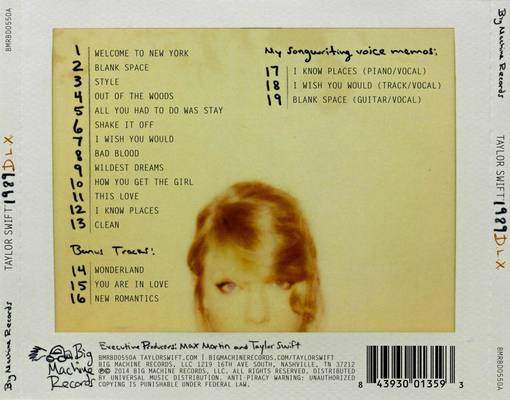
Image: The artwork for this album challenges the stereotypical image of female country singers. The Polaroid suggests that Taylor is taking a different approach to music as her clothing and the title ‘1989’ relates to the 80’s. Her face does not appear on the artwork, however this could be intentionally done to show Taylor reinventing her image and not allowing her previous status to effect the success of the new album. This contradicts the stereotypical country image as these albums would usually feature musical instruments or incorporate settings such as farms to help sell to those strongly interested in country music. Taylor’s cover breaks away those barriers and opens up her album to a wider audience than just her previous supporters.
Colours: The filter used here helps give the album the vintage
look Taylor is trying to achieve. It links in with the whole 80’s theme with
the Polaroid which suggests that this album is more quirky and fun.
Font: Taylor has hand written onto her album. This gives the
album a more personal touch which her fans will notice and appreciate. By only including
her initials T.S suggests that she is that popular that she does not need to
include her full name to try and sell her album or that she does not want her
name to influence her new potential audience.
From this research, I now have a greater understanding on the different types of artwork available and how they help promote a certain genre. My chosen artist produces indie/folk music however it has been beneficial to look at a wide range of variety of genres to decide on what approach I should take when producing my own digipak. Some artists follow the stereotypical conventions to promote their image and sell their music such as making their physical appearance their main focal point. Artists including Taylor Swift break away from these stereotypes as she reinvents her image in order to attract new fans, but keep her loyal supporters happy.
I have decided that my own digipak will stay close to the indie/folk genre as I believe this will be the best way to promote Oliver's music. It means that I can make a high quality product on a low budget, but still successfully sell my artists' music.
Tuesday 1 March 2016
Practice of Digipak and Poster Advert
After conducting research on digipaks and advert posters, I gained a greater understanding on how these products link together in order to promote the artist and their work.
I have learnt that it is important to consider how images, font, colour and theme represent the artist's star image and how that image should be continued throughout these products to appeal to their target audience.
For my own digipak and poster I have taken inspiration from existing products within the indie/folk genre and used their conventions to create ideas. This has helped me think about what elements would be successful in order to promote my artist.
Initial Ideas:
I want to stick closely to the theme of 'Peter Pan' for the products as it will successfully tie together the music video and the promotional items. This will be effective as the consumer will be able to identify a strong sense of the artist's star image. I will also incorporate relevant images that visually illustrates the themes in the songs. These images will include appropriate scenery including skies, fields, woodland areas etc as I believe this will give the best representation of the genre. On top on this, I will also think about including Oliver's existing theme of triangles. I believe that this concept should be highly considered as existing fans will identify the image and relate it back to Oliver's work.
Here I have tried to take images for the image to be used on the front of my poster and digipak. I have used images of Peter Pan, printed and cut them out and held up to the sky to get an image of the sun and clouds behind it. This will represent the theme of being 'high' and tie in with the image of Peter Pan that I wanted to incorporate.


However, after only using a paper cut out, my design did not work out how I imagined and I have to take an alternative approach. Instead, I will be experimenting on Photoshop to create a product I will feel confident with.
Final Stages: Photoshop
 Stage 1: Selecting template I wanted to use for my Digipak. The template is four panel which includes the front, inside, CD holder and back. This is a standard look for a digipak, but is usually the most common. I will have to design a piece of artwork for each panel.

Stage 2: I have inserted the images I want to use. These are all pictures that I have taken whilst filming my music video to make sure that the style of the digipak links in with the video. The images are typical of the indie/folk genre as it shows off the natural elements.

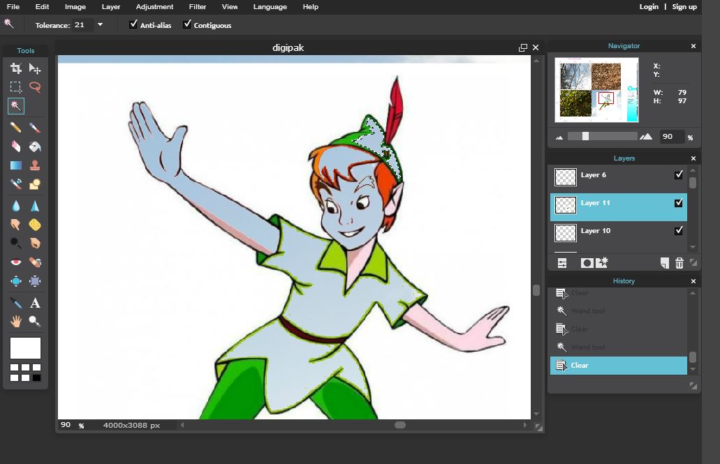
Stage 3: Here I have added a layer on top of the images. This has tested my skills on Photoshop as I have had to erase half of the picture so the image can be seen underneath. Adding layers such as Peter Pan will stick in with the theme of my video and create an establishing look.
 Stage 4: Here I have added more over lays onto the existing images. I have finished off the Peter Pan one as well as included an castle and a ribcage. The rib cage represents the thought of nature being inside of the artist and close to his heart whilst the castle illustrates the place he loved and grew up with knowing as a child. He makes reference to this place in the track which I thought would make a good visual connection.
 Stage 5: The final stage is adding the final touches. Here I have added on the track list to the back of the album. These tracks are all existing songs of my artist which I believe will promote his other existing work rather than just the one single. The font I have used is the same used on Oliver's existing album as it is current and slightly quirky, representing my artist's star image.
I have now created products that I feel confident to promote Oliver's work. The use of Photoshop has enhanced the quality of production as I was given the opportunity to use all of its features to experiment how I wanted my final products to look. Looking at my products, there are clear references to the indie/folk genre as I have incorporated images of nature and kept to a very natural colour scheme. I have also tried to include the narrative of Peter Pan from my music video as I believe this will make all three products memorable to followers of my artist. As for other existing products in this genre, my digipak design appears original in result of my ambition to stick to a theme. This will be effective as it signals out my artist's look which is key when competing with other unsigned artists in this genre.
I have learnt that it is important to consider how images, font, colour and theme represent the artist's star image and how that image should be continued throughout these products to appeal to their target audience.
For my own digipak and poster I have taken inspiration from existing products within the indie/folk genre and used their conventions to create ideas. This has helped me think about what elements would be successful in order to promote my artist.
Initial Ideas:
I want to stick closely to the theme of 'Peter Pan' for the products as it will successfully tie together the music video and the promotional items. This will be effective as the consumer will be able to identify a strong sense of the artist's star image. I will also incorporate relevant images that visually illustrates the themes in the songs. These images will include appropriate scenery including skies, fields, woodland areas etc as I believe this will give the best representation of the genre. On top on this, I will also think about including Oliver's existing theme of triangles. I believe that this concept should be highly considered as existing fans will identify the image and relate it back to Oliver's work.
Here I have tried to take images for the image to be used on the front of my poster and digipak. I have used images of Peter Pan, printed and cut them out and held up to the sky to get an image of the sun and clouds behind it. This will represent the theme of being 'high' and tie in with the image of Peter Pan that I wanted to incorporate.


However, after only using a paper cut out, my design did not work out how I imagined and I have to take an alternative approach. Instead, I will be experimenting on Photoshop to create a product I will feel confident with.
Final Stages: Photoshop
 Stage 1: Selecting template I wanted to use for my Digipak. The template is four panel which includes the front, inside, CD holder and back. This is a standard look for a digipak, but is usually the most common. I will have to design a piece of artwork for each panel.
Stage 2: I have inserted the images I want to use. These are all pictures that I have taken whilst filming my music video to make sure that the style of the digipak links in with the video. The images are typical of the indie/folk genre as it shows off the natural elements.
Stage 3: Here I have added a layer on top of the images. This has tested my skills on Photoshop as I have had to erase half of the picture so the image can be seen underneath. Adding layers such as Peter Pan will stick in with the theme of my video and create an establishing look.


I have now created products that I feel confident to promote Oliver's work. The use of Photoshop has enhanced the quality of production as I was given the opportunity to use all of its features to experiment how I wanted my final products to look. Looking at my products, there are clear references to the indie/folk genre as I have incorporated images of nature and kept to a very natural colour scheme. I have also tried to include the narrative of Peter Pan from my music video as I believe this will make all three products memorable to followers of my artist. As for other existing products in this genre, my digipak design appears original in result of my ambition to stick to a theme. This will be effective as it signals out my artist's look which is key when competing with other unsigned artists in this genre.
Monday 29 February 2016
Filming Timetable
Filming Timetable
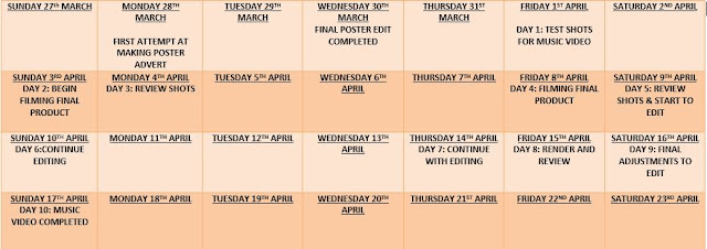
I have created a filming and editing timetable to ensure I keep control over my time keeping for this project. It is important that I follow this timetable to ensure that I have enough time to complete production and post production tasks before my work has to be submitted.By producing a timetable, not only will I be gaining time management skills, but will also be sticking to a tight schedule that would be used within the industry. This will show my development from an AS student to an A2 student as I have multiple tasks to be completed in a tighter time frame than in my previous year.

I have created a filming and editing timetable to ensure I keep control over my time keeping for this project. It is important that I follow this timetable to ensure that I have enough time to complete production and post production tasks before my work has to be submitted.By producing a timetable, not only will I be gaining time management skills, but will also be sticking to a tight schedule that would be used within the industry. This will show my development from an AS student to an A2 student as I have multiple tasks to be completed in a tighter time frame than in my previous year.
Sunday 28 February 2016
Equipment List
This is all the equipment required to film my final music video;
This will be the camera I will use to film the shots for my music video. Owning this camera will enables me to go out and film unplanned shots without being restricted to accessing it. In addition to this, I feel confident and familiar with how the camera functions and believe I will use it effectively to ensure I get the professional results I am planning to receive.
To ensure that my shots are steady and clean, I will be using a tripod to balance my camera on. This will give my shots a more smoother and professional appearance which will compete with existing products available to the public.
After using this software last year to edit my film opening, I am confident to use this again during the post-production stage. I am now more familiar with its features such as transitions, SFX, cutting tools and so on and believe that I will produce a high standard product.
 |
| CAMERA - Nikon 3D200 |
 |
| TRIPOD FOR CAMERA |
To ensure that my shots are steady and clean, I will be using a tripod to balance my camera on. This will give my shots a more smoother and professional appearance which will compete with existing products available to the public.
 |
| SONY VEGAS MOVIE STUDIO |
- Costumes (Peter Pan's costume, hat, shirt, trousers, shoes etc)
- Props (bow and arrow, natural resources)
- Storyboard (to follow storyboard)
- Laptop (editing)
It is important that I bring all the equipment needed along to each shooting session. If anything is forgotten or becomes broken it will decrease the amount of time I have to film and may cut into my editing schedule which ultimately will lead to a rushed product.
Friday 26 February 2016
Locations
Locations
After researching about the stereotypical conventions of Indie/Folk music videos, analysing existing products and annotating the lyrics of my chosen song, I have decided on the locations where I am going to film my own music video. I have chosen places such as castle ruins, rivers, play grounds and so on as these places reflect the genre I am portraying as well as allowing me unlimited access to film.
Inspiration: Ellie Goulding - Guns and Horses


This particular video has given me inspiration for my own music video as the settings have clear references to the indie/folk genre. The focal location is in a woodland area which indicates that the video was produced on a low budget. Since this was one of Ellie's first music videos, it is very likely that she would have had to use locations which were easy to film in and more cost efficient. This type of setting would be ideal for my own production due to the similar situation my artist is in with starting out his music career. In addition to this, it will be more easier for me to re-visit locations like this to re-film any extra shots due to living in a rural area.
Lewis Watson - Into the Wild


I am also inspired by the settings used in this music video. Although the director has chosen similar locations as Ellie Goulding's 'Guns and Horses' video, these locations help visually illustrate the lyrics of the song. For example, as Watson sings the chorus for the final time 'Step out into the wild' he is shot actually performing outside. This relates to Goodwin's amplifying theory which I am interesting in following due to the narrative I have decided to tell in my own video.
Location Ideas:
After much thinking and exploring my local area, I have selected a few locations to film my music video. These locations include; castle ruins, play ground, woodland, river etc where I believe will be suitable for my production. Not only will I be able to access these places with ease on a low budget, but I will be able to incorporate these locations to help tell a story to my audience. All these factors together will help me create a product which follows the typical Indie/Folk conventions and look comparable with other existing products available.
 Playing Field:
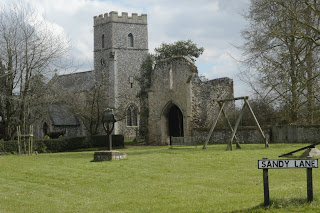
I have chosen this location based on the accessibility and the facilities it has to offer. Since my main protagonist is a child, a playing field is a perfect location to use to show the persona having fun and enjoying the outdoors. Another bonus of using this location is the church grounds in the background. This building will help amplify the lyrics in the song if I choose to feature it in shots.
 Woodland/River:
This location is ideal for my production as other artists in this genre uses similar places in their videos. It is easy to access and will help me illustrate my narrative.
 Castle Ruins:
This will be my focal location for my music video. I have decided this as I believe it will help illustrate the meaning of the song best to the potential audience. For example, when the lyric 'in these fields of ageing stones' play, I will incorporate footage of the castle ruins to amplify the words. This will invite the audience into Oliver's home town where they can personally connect with his feelings and emotions.
After researching about the stereotypical conventions of Indie/Folk music videos, analysing existing products and annotating the lyrics of my chosen song, I have decided on the locations where I am going to film my own music video. I have chosen places such as castle ruins, rivers, play grounds and so on as these places reflect the genre I am portraying as well as allowing me unlimited access to film.
Inspiration: Ellie Goulding - Guns and Horses


This particular video has given me inspiration for my own music video as the settings have clear references to the indie/folk genre. The focal location is in a woodland area which indicates that the video was produced on a low budget. Since this was one of Ellie's first music videos, it is very likely that she would have had to use locations which were easy to film in and more cost efficient. This type of setting would be ideal for my own production due to the similar situation my artist is in with starting out his music career. In addition to this, it will be more easier for me to re-visit locations like this to re-film any extra shots due to living in a rural area.
Lewis Watson - Into the Wild


I am also inspired by the settings used in this music video. Although the director has chosen similar locations as Ellie Goulding's 'Guns and Horses' video, these locations help visually illustrate the lyrics of the song. For example, as Watson sings the chorus for the final time 'Step out into the wild' he is shot actually performing outside. This relates to Goodwin's amplifying theory which I am interesting in following due to the narrative I have decided to tell in my own video.
Location Ideas:
After much thinking and exploring my local area, I have selected a few locations to film my music video. These locations include; castle ruins, play ground, woodland, river etc where I believe will be suitable for my production. Not only will I be able to access these places with ease on a low budget, but I will be able to incorporate these locations to help tell a story to my audience. All these factors together will help me create a product which follows the typical Indie/Folk conventions and look comparable with other existing products available.
I have chosen this location based on the accessibility and the facilities it has to offer. Since my main protagonist is a child, a playing field is a perfect location to use to show the persona having fun and enjoying the outdoors. Another bonus of using this location is the church grounds in the background. This building will help amplify the lyrics in the song if I choose to feature it in shots.
This location is ideal for my production as other artists in this genre uses similar places in their videos. It is easy to access and will help me illustrate my narrative.

This will be my focal location for my music video. I have decided this as I believe it will help illustrate the meaning of the song best to the potential audience. For example, when the lyric 'in these fields of ageing stones' play, I will incorporate footage of the castle ruins to amplify the words. This will invite the audience into Oliver's home town where they can personally connect with his feelings and emotions.
Subscribe to:
Posts (Atom)